Python Finance Plot
```html
Python for Finance: Visualizing Data with Plots
Python, with its rich ecosystem of libraries, has become a cornerstone for financial analysis. A crucial aspect of this analysis involves visualizing data to identify trends, patterns, and anomalies. Plotting libraries like Matplotlib, Seaborn, and Plotly empower financial analysts to create insightful charts and graphs that communicate complex information effectively.
Essential Plotting Libraries
Matplotlib is the foundational library for creating static, interactive, and animated visualizations in Python. It offers fine-grained control over plot elements, allowing you to customize axes, labels, titles, and colors. While powerful, Matplotlib can require more code to achieve aesthetically pleasing and complex visualizations.
Seaborn builds on top of Matplotlib and provides a higher-level interface for creating informative and visually appealing statistical graphics. It simplifies the process of generating common financial plots like histograms, scatter plots, and heatmaps with sensible defaults and built-in styling.
Plotly is a library for creating interactive, web-based visualizations. It's particularly useful for financial dashboards and reports where users can explore data through zooming, panning, and hovering. Plotly supports a wide range of chart types, including candlestick charts, which are essential for analyzing stock prices.
Common Financial Plots
Line Charts: Displaying stock prices or index values over time is best achieved with line charts. They clearly illustrate trends and fluctuations. Using Matplotlib or Seaborn, you can easily create line charts with date axes and appropriate labels.
Candlestick Charts: These charts are indispensable for analyzing stock market data. Each candlestick represents the open, high, low, and close prices for a specific period. Plotly is particularly well-suited for creating interactive candlestick charts that allow users to zoom into specific timeframes.
Histograms: Understanding the distribution of returns or trading volumes can be visualized with histograms. They show the frequency of different values within a dataset, helping to identify skewness and volatility patterns.
Scatter Plots: Investigating the relationship between two financial variables, such as interest rates and stock prices, can be done using scatter plots. Seaborn offers features like regression lines and color-coding to highlight correlations and patterns.
Box Plots: Comparing the distribution of multiple datasets, such as the returns of different asset classes, is easily done with box plots. They provide a concise summary of the median, quartiles, and outliers of each dataset.
Example: Stock Price Line Chart
Here's a simplified example using Matplotlib to plot a stock price:
import matplotlib.pyplot as plt import pandas as pd # Assuming you have stock data in a pandas DataFrame named 'df' with 'Date' and 'Close' columns # df = pd.read_csv('stock_data.csv', index_col='Date', parse_dates=True) # Sample data (replace with your actual data) data = {'Date': pd.to_datetime(['2023-01-01', '2023-01-08', '2023-01-15', '2023-01-22', '2023-01-29']), 'Close': [150, 155, 152, 158, 160]} df = pd.DataFrame(data) df = df.set_index('Date') plt.figure(figsize=(10, 6)) plt.plot(df.index, df['Close']) plt.xlabel('Date') plt.ylabel('Stock Price (USD)') plt.title('Stock Price Over Time') plt.grid(True) plt.show() This code snippet demonstrates how to create a basic line chart showing stock price fluctuations over time. You'll need to replace the sample data with your actual stock data, often sourced from APIs or CSV files.
By mastering these plotting techniques, financial analysts can transform raw data into actionable insights, facilitating better decision-making in trading, investment, and risk management.
```
 1362×625 python finance data visualization from mlq.ai
  944×679 plot stock chart mplfinance python yong hong tan python from python.plainenglish.io
 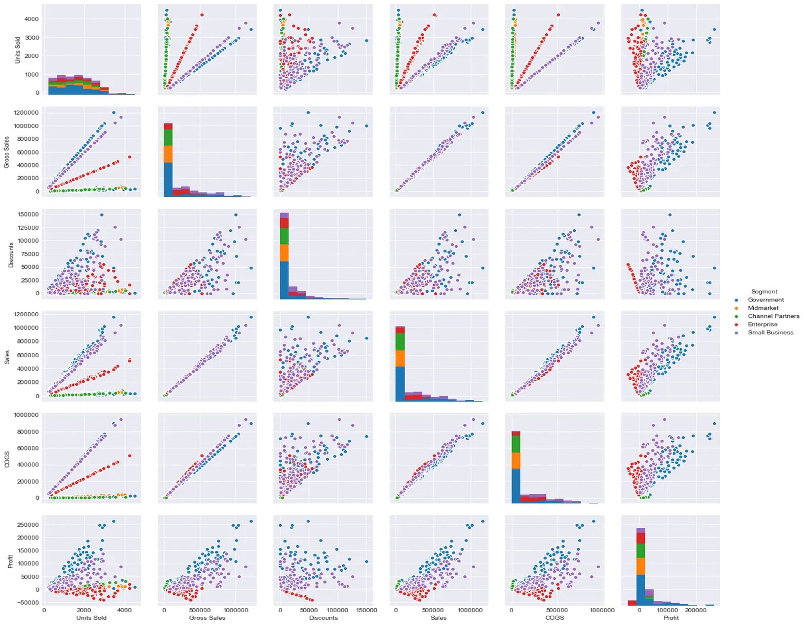 1572×1221 seaborn module python distribution plots python finance from www.pythonforfinance.net
  799×450 visualising trading signals python financial apis academy from eodhistoricaldata.com
  1097×552 plotting financial data chart plotly python wasin from medium.com
  900×659 python programming tutorials from pythonprogramming.net
  875×629 plot stock chart mplfinance python from plainenglish.io
  1200×782 simple guide plotly plotting financial chart yong hong from python.plainenglish.io
  611×532 lets face creating beautiful charts financial data python from en.rattibha.com
  974×596 python finance complete beginners guide sonsuz design from sonsuzdesign.blog
  936×491 simple guide financial modeling prep api python from benjaq.medium.com
  1536×779 python data visualization finance analyzing alpha from analyzingalpha.com
  745×425 python finance part yahoo google finance api pandas from www.learndatasci.com
  1400×694 jack mckews blog python finance industry from jackmckew.dev
  0 x 0 financial visualizations python beginner python from www.youtube.com
  480×360 financial plots python youtube from www.youtube.com
  0 x 0 financial data visualization pyplot python tutorial youtube from www.youtube.com
  2000×1000 charts customizing mplfinance plot python stack overflow from stackoverflow.com
  891×508 quick guide beautiful scatter plots python hair parra from towardsdatascience.com
  900×619 step step create stock price plot python from trading-data-analysis.pro
  1358×652 python finance automated analysis financial markets from towardsdatascience.com
  0 x 0 python finance youtube from www.youtube.com
  1068×504 python finance indian stock market data analysis ravichandrans from ravic499.blogspot.com
  2300×1098 perform proper financial analysis python finance from www.reddit.com
  1200×900 financial charts visuals plotly python nikhil adithyan from medium.com
  702×507 python finance introductory programming tutorial toptal from www.toptal.com
  1280×720 python financial analysis graphs displays stock price from www.youtube.com
  0 x 0 python finance introduction plotting charting trading from www.youtube.com
  1358×778 visualizing financial data pythons plotly suha memon medium from medium.com
